A low-code platform that lets financial institutions build digital processes (mortgages, loans, onboarding) in weeks instead of years, without writing them by hand.
Product Designer · Core → Rendering · Web, low-code · Sept 2024 – present (~2 yrs)
FlowX.AI
In brief
My role was to make enterprise complexity feel understandable. FlowX is built around BPMN (Business Process Model and Notation), the visual process a bank configures a mortgage application, a loan approval or a KYC check around instead of writing it by hand, and I started on the team that owns that process engine before moving into the team that turns a configured process into the interface an end customer actually uses.
FlowX Command: one of several AI surfaces across the platform, sources cited inline.Over two years at FlowX, I designed experiences that transformed highly technical systems into interfaces business users could confidently navigate. As the platform evolved from low-code to AI-powered SaaS, I worked across some of its most complex areas, including configuration builders, AI chat, workflow orchestration, access control, version management and dependency resolution.
Why it mattered
Enterprise platforms become exponentially harder to use as capabilities grow. Every new feature adds another layer of complexity, making it increasingly difficult for users to understand relationships, predict outcomes and configure the system with confidence.
My work focused on preserving the platform’s power while making it easier to understand, navigate and reason about. Separately, I rolled out Dovetail as the shared research tool across the organization, before any AI tooling entered the picture, and later helped build a Claude Skill to synthesize interviews and extract insights.
Design challenges
Seven problems kept resurfacing across two years of work, each demanding its own answer, covered chapter by chapter below:
- Reducing uncertainty when two people change the same process at once.
- Seeing what changed before a merge, not after.
- Improving navigation as a product's structure grows more complex and business needs change.
- Keeping AI chat predictable and transparent across very different client needs.
- Making shared dependencies across libraries visible and safe to build on.
- Isolating what needs to stay private across departments and business lines, without getting in the way of the collaboration that should cross those boundaries.
- Making enterprise configuration understandable despite hundreds of possible settings.
Designing for technical and non-technical users
Platform choice, description, roles: one form, both audiences.My users ranged from business analysts to developers and platform administrators. One of the biggest challenges was designing interfaces that balanced technical flexibility with the accessibility expected from a low-code platform, allowing different user groups to collaborate within the same system.
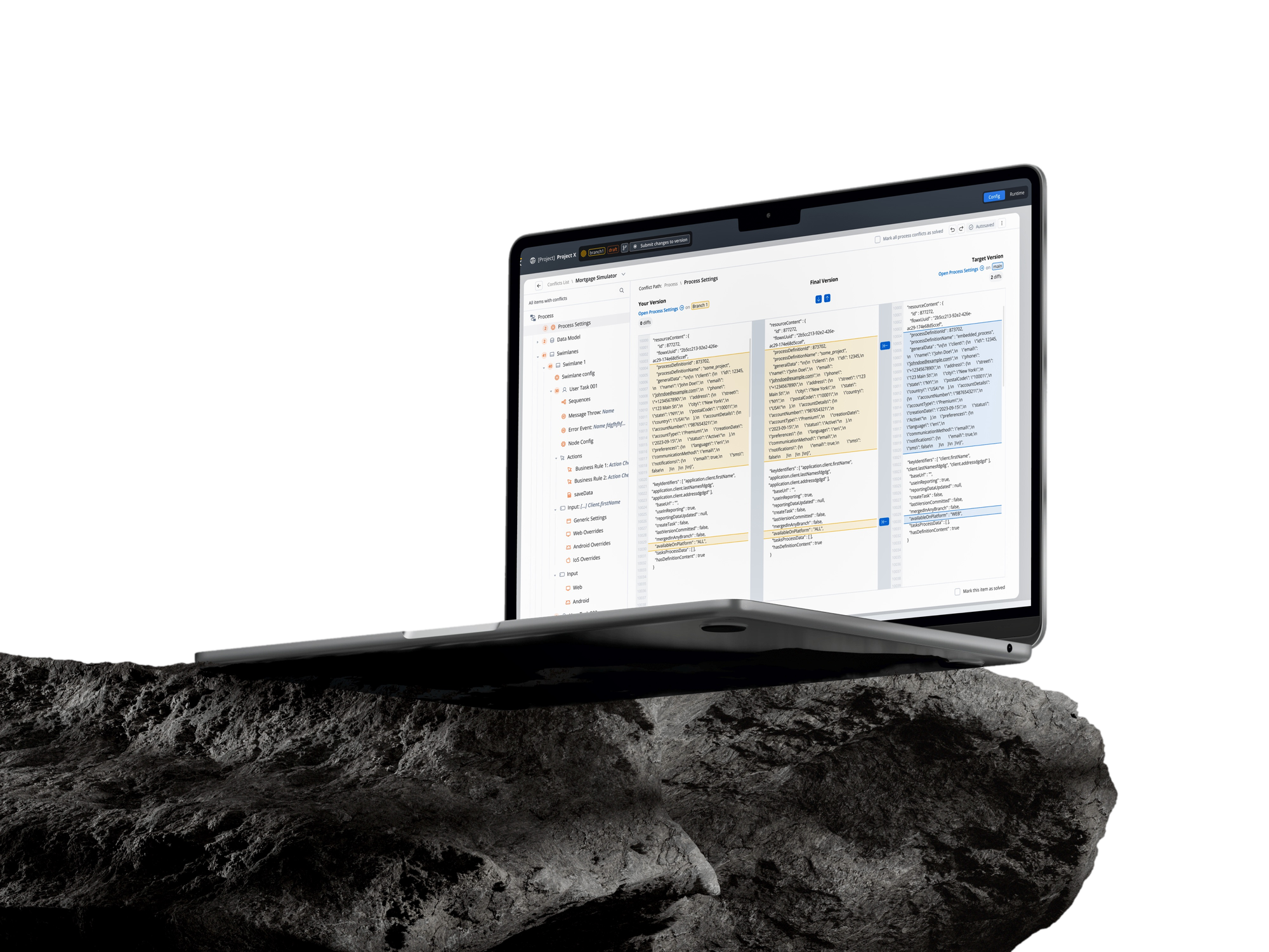
Two people change the same process. Neither can see what the other did.
For the banks building on FlowX, that blind spot stretched process work into weeks, and the people resolving the conflicts couldn’t read the raw JSON they arrived as.
Show a change the way they think about the process, not the way the system stores it.
Every change pinned to a place in the flow: a task, a swimlane, a rule. Never a line number.
Merges that used to run for weeks now close in days.
Teams build on the same process at once, instead of working around each other.
We've been eager for this. The merge no longer fails, and we can keep shipping at a fast pace.
See more detailsHide details
Search for specific parts of the process.
Split view by BPMN process parts, for easier context around code snippets.
Counter for collapsed categories.
Color coding for items with conflicts vs. items marked as resolved.
Possibility to open the specific code block translated into content, for easier recognition of conflicts and changes.
Clear indication when something doesn't exist or was deleted, instead of showing a missing code block.
Clear conflict path.
Possibility to open the specific code block translated into content, for easier recognition of conflicts and changes.
Clear indication when something doesn't exist or was deleted, instead of showing a missing code block.
Clear conflict path.
Search for specific parts of the process.
Split view by BPMN process parts, for easier context around code snippets.
Counter for collapsed categories.
Color coding for items with conflicts vs. items marked as resolved.
Before jumping into code, users get an overview of where the conflicts are and can take them one by one for each resource.
There is also a clear indication of what happens if no conflicts are resolved (what changes are prioritized by default).
Before jumping into code, users get an overview of where the conflicts are and can take them one by one for each resource.
There is also a clear indication of what happens if no conflicts are resolved (what changes are prioritized by default).
Finding the conflict
- A conflicts overview lists every affected resource up front, so configurators can work through them one at a time instead of guessing where the conflicts even are.
- Search across the process to jump straight to the part in conflict.
- The tree is split by BPMN structure (process settings, swimlanes, tasks, actions), so a code block always comes with the context of where it lives.
- A breadcrumb keeps the exact conflict path visible, e.g. User Task 1 › UI Elements › Container › Card › Onboarding Form.
- Collapsed tree branches show a count, so nothing conflicting is hidden without a trace.
Resolving it
- A clear default: unless a branch is chosen explicitly, its changes are what get prioritized when a conflict is left unresolved.
- Raw JSON is translated into readable, formatted content per resource, with the actual diff highlighted.
- Conflicts can be marked resolved one at a time, or for an entire process at once.
- A deleted resource shows a clear “deleted in your version” state instead of a blank, missing code block.
- Color coding distinguishes items still in conflict from items already marked resolved.
- Progress can be saved as an intermediate state, rather than needing to resolve everything in one sitting.
Before a merge, no one could see what had actually changed.
Configurators needed to catch conflicts coming, and to see the progress teammates had made, long before a merge forced the question.
Surface the history before a conflict forces the question.
See what changed, and by whom, so a merge is never the first time you learn what happened to a project while you weren’t looking.
Check a project’s state at a glance: an afternoon’s changes or a month’s.
See more detailsHide details
Overview of versions being compared, including last edited date, user, name, and whether it's committed or not.
Clear visual indication of what versions are selected.
Overview of versions being compared, including last edited date, user, name, and whether it's committed or not.
Clear visual indication of what versions are selected.
Structure first, detail second: the way people already think about a flow.
One panel, split in two: the flow’s top-level structure above, the selected component’s tree below. New flows open on structure.
Orientation stopped being something the tool had to explain.
See more detailsHide details
The navigation that shipped:a single vertical panel in the UI Designer’s left sidebar, split into two stacked sections. Navigationis a flat list of the flow’s root-level items (Pages, Tab Bars, Global Components). Components Tree is the full nested tree of whatever root or global component is selected, the two sharing one resizable split, with the tree taking two-thirds by default.
What the first version got wrong
- Switching the page felt disconnected from the rest of the navigator.
- Adding a new page while viewing another momentarily read as “my first page got deleted.”
- The collapse/expand icon on the tree didn’t communicate its function; there was a lot of hesitation around it.
- No process-like diagram existed for UI Flows. Joining a project meant real effort to figure out “which button leads where,” since navigation was buried inside each UI element.
In hindsight: push earlier for a more considered first pass, making a stronger case for it up front rather than optimizing purely for speed.
Every client wanted a different chat. We couldn’t build three.
One needed a floating chat, another a fixed panel that reacts to input, another a full dedicated page. It was the largest, most complex piece UI Flows added.
One configurable component that flexes across all three, and stays predictable.
Predictable the way the rest of the platform is: show exactly what happened and when, make it obvious when the agent can no longer act, and let people correct it when it’s wrong.
One component absorbed three very different client needs. No client waited on a bespoke build.
See more detailsHide details
A chat isn’t just an interface. Behind it runs its own workflow, built from nodes like these three: Start Agent kicks off the conversation, Text Generation writes a reply, and Custom Agent is the most capable one, carrying its own instructions, a knowledge base and a set of tools.
Over roughly six months, features arrived gradually: suggested prompts, notifications, the ability to upload and read documents, actions, and feedback.
- Message actions: copy message content, see the exact timestamp.
- Search across every past conversation by keyword.
- Chat sessions can be disabled once the linked business case reaches a status that no longer allows further interaction.
- Notifications surface new information in the chat with a visual cue.
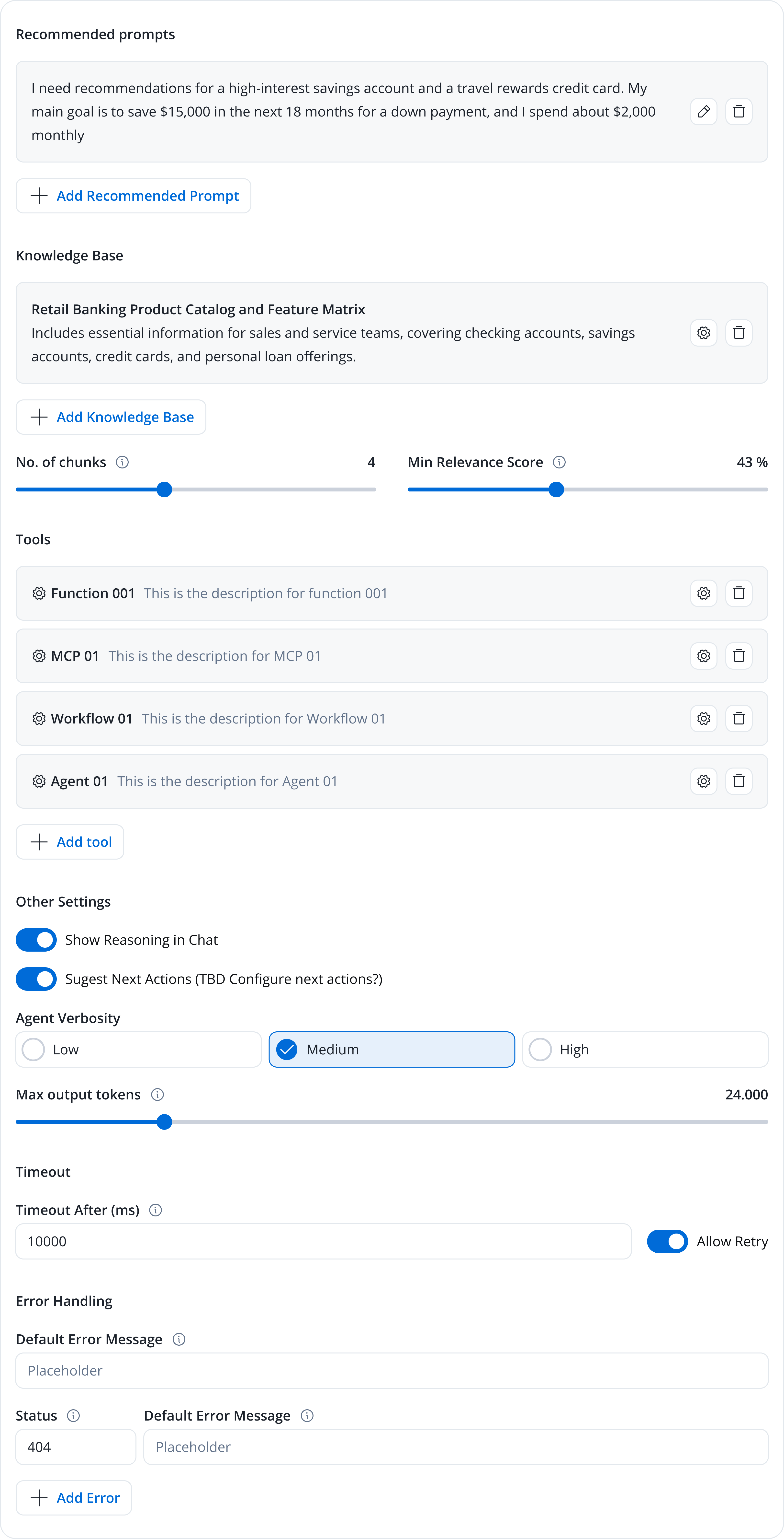
1. The conversational workflow behind the chat · 2. The agent’s settings panel
The Custom Agent node from earlier is what’s actually replying here, now paired with a new one: Navigate in UI Flow.
Since the chat shipped, its workflow has grown a version built specifically for conversations. It tracks the exchange itself, remembering what’s been said and deciding where each reply should go, and pulls in the recent messages plus a summary of everything earlier automatically, so the agent already knows what happened instead of needing to be told.
Navigate in UI Flow is the new piece: a node that lets the same Custom Agent open a form mid-conversation, already filled in with what it just learned. Saying “let me open your account details” now actually opens the screen. One more change folds intent detection and branching into a single node, instead of two.
The same KYC flow, copied into five libraries. Update one, chase the other four.
Libraries could already be shared across projects, but they couldn’t depend on other libraries. So when several libraries needed the same resources, teams had to copy them, and those copies drifted out of sync.
Point to a shared resource instead of copying it, and make precedence a rule, not a guess.
One library can now depend on another, so shared resources are defined once and inherited wherever they’re needed. When different builds of the same library meet in the dependency tree, a fixed precedence rule determines which one is used.
Update the foundation once, and the change flows into everything built on it.
Teams build on shared foundations instead of duplicating them: independent, but on the same definitions, with versions that no longer feel risky.
See more detailsHide details
At the scale these organizations work, copying adds up fast: the same logic everywhere, versions drifting, any small update repeated in five places. The job wasn’t to expose the dependency machinery; it was to explain a genuinely complex situation simply enough that a configurator could decide with confidence.
- Customer Models
- Enums
- KYC
- Customer Models
- Enums
- KYC
The same resources, copied into each library: duplicated logic, drifting versions, high coordination cost.
Shared resources live once, in a foundation both domains build on: defined in a single place, inherited everywhere.
The first attempt was more direct: let teams copy a resource, with everything it needed, from one project to another. It solved the immediate problem and created a harder one: a copy could point to a library already present on a different version. Which one wins, and how does anyone see what will happen before committing?
One library, two builds: 1.5.0 arrives with the copy, 1.6.0 already lives in the destination. Which one should win, and what breaks either way?
The copy dialog resolved into three honest states. A plain copy shows New Dependencies: a calm preview of what’s about to be added. A version clash shows Dependency Conflicts Detected, with only the conflicting versions in red. A copy that would loop back on itself is simply refused, in plain language. The hardest case, several conflicts at once, folds into one Dependency Changes tree, so a single decision covers the whole impact.
That exploration led directly to library-to-library dependencies. When a library adds one, it’s locked to a specific version, so a shared foundation can move forward without changing everything on top of it. And when two versions collide, one rule decides every time: the project’s own version first, then the closest library, with the newest build only as a tie-breaker.
Many departments, one platform, and no clean line between them.
Someone in one business line could reach another’s projects. But walling everything off would break the collaboration the platform exists for, and roles alone couldn’t scale to the difference.
Intentional isolation, not maximum isolation, from a small set of mechanisms that compose.
Workspaces scope each department. RBAC carries the broad permissions, ACLs the resource-specific ones, groups grant many people at once, and exceptions handle the one-offs, without inventing a role for every case.
Access became contextual: who you are, where you’re working, and what you’re allowed to touch.
And changing it meant rethinking how permissions propagate through the rest of the product, not just adding a settings screen.
See more detailsHide details
Before any screen, this was a systems problem: defining the relationships between organizations and workspaces, users, groups, roles, permissions and resources, so the whole thing could answer one question: who can see or change what, in which context, and what happens when a resource needs to cross a boundary.
Read as one sentence: a permission is a subject × a grant × a resource, always inside a single workspace. The design work was defining those relationships, not drawing a settings screen.
An effective permission isn’t authored in one place; it’s resolved. A broad role sets the baseline, a resource-specific list narrows or widens it, and an explicit exception has the final say, which is exactly what keeps the role list from exploding.
A baseline for a whole class of people — what an “Editor” or a “Configurator” can do, everywhere.
A specific list on a specific resource, so one project or library can be opened up or locked down on its own.
An explicit allow or deny for one person or one group — the escape hatch that avoids inventing a whole new role.
Isolated by default, shared on purpose. Resources stay private to their workspace; a shared library is the deliberate exception that crosses the boundary.
- Onboarding
- Card Issuing
- private to this workspace
- Application
- Underwriting
- private to this workspace
Everything the model touched had to change with it:
- Ownership: creating or importing a project raised the question of who owns it, and who can extend access to others.
- Audit logs: access rules had to stop someone indirectly learning about projects they can't see.
- Library dependencies: some shared resources needed to stay usable across a boundary even when their underlying configuration wasn't directly accessible.
- Imports: bringing in resources reopened questions of visibility, ownership and inherited access.
And it wasn’t greenfield: existing customers, with real projects and resources, had to move onto the new model. The first release balanced the ideal against what they and the timeline could absorb: a few capabilities were deliberately deferred, moving projects between workspaces and transferring ownership among them.
Hundreds of settings, in a panel that had drifted out of step with the platform.
And aligning it with the Process panel broke something: two side panels now wanted the same space at once.
Replace content in place: the referenced context takes over the panel, with a path back.
And reorganize each component’s settings around what users mean, not how the system stores it: plain terms, inline editing, rules summarized.
Stronger consistency, a more mature product, and fewer panic clicks.
The back-and-forth saves and extra tabs people opened out of uncertainty about what they were about to lose.
See more detailsHide details
Explorations ran in parallel with a colleague on both panels. A PR built with Claude Code stood up both quickly enough to test against each other, rather than mocking them separately and guessing how they’d interact. Four directions were tried and set aside before the one that shipped:
| Solution | Challenge |
|---|---|
| Cascading side panels | Double save is unclear. It’s hard to tell which one is being saved first. |
| Replace content in place, with a way to navigate back | The same double-save problem resurfaces, and users lose context navigating back and forth. |
| A “go to” button opening full config in a separate browser tab | Introduces tabs into the configuration flow, which the team didn’t want. |
| Open the referenced context in a modal, reusing the testing-modal pattern | Inconsistent with the node config side panel: the same information ends up presented two different ways. |
From Form Builder to Configuration Builder:the same Single Select component’s settings, reorganized around user concepts instead of implementation details, to cut visual noise and make complex configurations easier to understand.
Terminology, from technical to human language: developer-centric labels become user-friendly terms. “Component Identifier” becomes “Component Name,” “Expressions” becomes “Conditions.”
Static Sources, a clearer information hierarchy: extracted into its own dedicated section, reinforcing its relationship to the datasource configuration.
Editing, direct and inline: each row becomes directly editable on click, removing the separate edit action and the clutter it added.
Condition editors, progressive disclosure: large, always-visible editors become concise summaries. Research showed people rarely viewed the full expression; they mostly opened it to edit.
Permissions, rules at a glance: long, form-based permission builders become readable rule summaries, so access logic is understandable without scrolling through multiple controls.
Terminology, from technical to human language: developer-centric labels become user-friendly terms. “Component Identifier” becomes “Component Name,” “Expressions” becomes “Conditions.”
Static Sources, a clearer information hierarchy: extracted into its own dedicated section, reinforcing its relationship to the datasource configuration.
Editing, direct and inline: each row becomes directly editable on click, removing the separate edit action and the clutter it added.
Condition editors, progressive disclosure: large, always-visible editors become concise summaries. Research showed people rarely viewed the full expression; they mostly opened it to edit.
Permissions, rules at a glance: long, form-based permission builders become readable rule summaries, so access logic is understandable without scrolling through multiple controls.
Across the merge process, version history, dependencies, navigation, AI chat, who can reach what, and configuration, one thing carried through all of it: enterprise complexity isn’t something to hide, it’s something to make understandable, so people can move fast without fear of breaking what came before.
A photograph of mine, just below ↓